Legend & colours
The legend names the parties and, optionally, counts their seats. Colours can come from three different places, and knowing which one wins saves a lot of confusion.
Legend
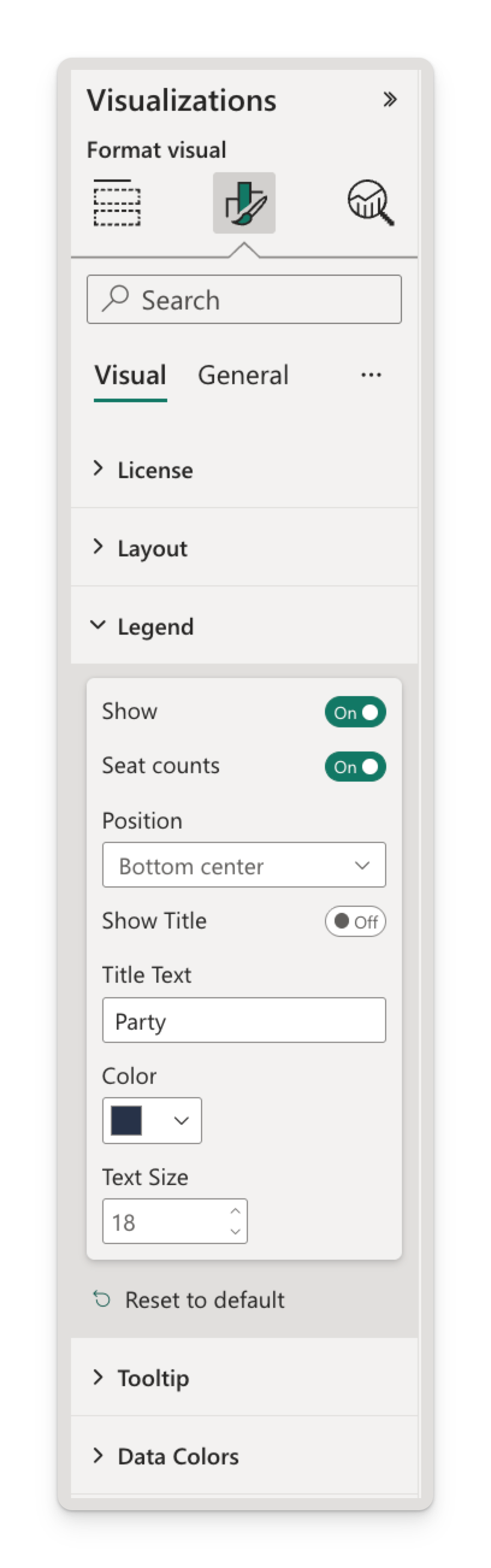
Format → Legend — on by default.
| Setting | Options | Default |
|---|---|---|
| Show | On · Off | On |
| Seat counts | On · Off | Off |
| Position | Top · Top center · Bottom · Bottom center · Left · Left center · Right · Right center | Bottom center |
| Show Title | On · Off | Off |
| Title Text | Free text | Party |
| Color | Any colour | #666666 |
| Text Size | 6 – 60 | 10 |
Seat counts in the legend
Turning Seat counts on appends each party's total to its entry — Labour (411) — which turns the legend into a compact results table beside the chart.
Seat counts off

Seat counts on

- Counts are formatted with your locale's thousands separator.
- The count is what the chart actually drew, so it always agrees with the seats on screen.
- When space is tight, the party name is shortened with an ellipsis before the number is touched — and if there's no room for a name at all, the entry shows just the count. The number is never truncated into something misleading.
Seat counts plus Show Total Seats gives you the whole result without a second visual: parts in the legend, total in the middle.
Position
The eight positions are four sides, each in a top/left-aligned and a centred variant:
| Position | Where the legend sits |
|---|---|
| Top / Bottom | A horizontal row above or below the chart, aligned left |
| Top center / Bottom center | The same row, centred |
| Left / Right | A vertical column beside the chart, aligned top |
| Left center / Right center | The same column, vertically centred |
Choose by party count, not by taste:
- Up to about six parties — a horizontal legend (Bottom center is the default for good reason) reads cleanly and leaves the arch its full width.
- More than six — a Right or Right center column. Horizontal legends squeeze each entry's text and start truncating names.
- Many parties on a small tile — the legend gains scroll arrows rather than dropping entries. If you're seeing arrows, either switch to a side position or turn the legend off and rely on tooltips.
Title
Show Title is off by default, so no title is drawn until you turn it on. Title Text then supplies the wording — it starts at Party, and you'd typically change it to Group, Team, Bloc or whatever your categories actually are.
Order
The legend is ordered exactly like the arch: by Sort Order if you bind one, otherwise alphabetically. The two can't disagree.
Clicking and hovering the legend
The legend isn't decoration — it's a control surface:
- Click an entry to select that party and cross-filter the report.
- Ctrl+click (⌘+click on Mac) to add parties to the selection.
- Hover an entry to light up its wedge and show its name and seat count in the centre of the arch, without filtering anything.
Full detail in Interactivity.
Parties that aren't there
A party whose seat count is zero or blank — filtered out, or genuinely holding no seats — gets no legend entry and no wedge. The legend lists what's drawn, nothing more.
Party colours
A party's colour is resolved from three sources, in this order. The first one that has a value wins.
| Priority | Source | Where it lives |
|---|---|---|
| 1 | The Custom Color field | A column in your data model |
| 2 | The Data Colors card | The Format pane, per report |
| 3 | The report theme palette | Your theme, applied automatically |
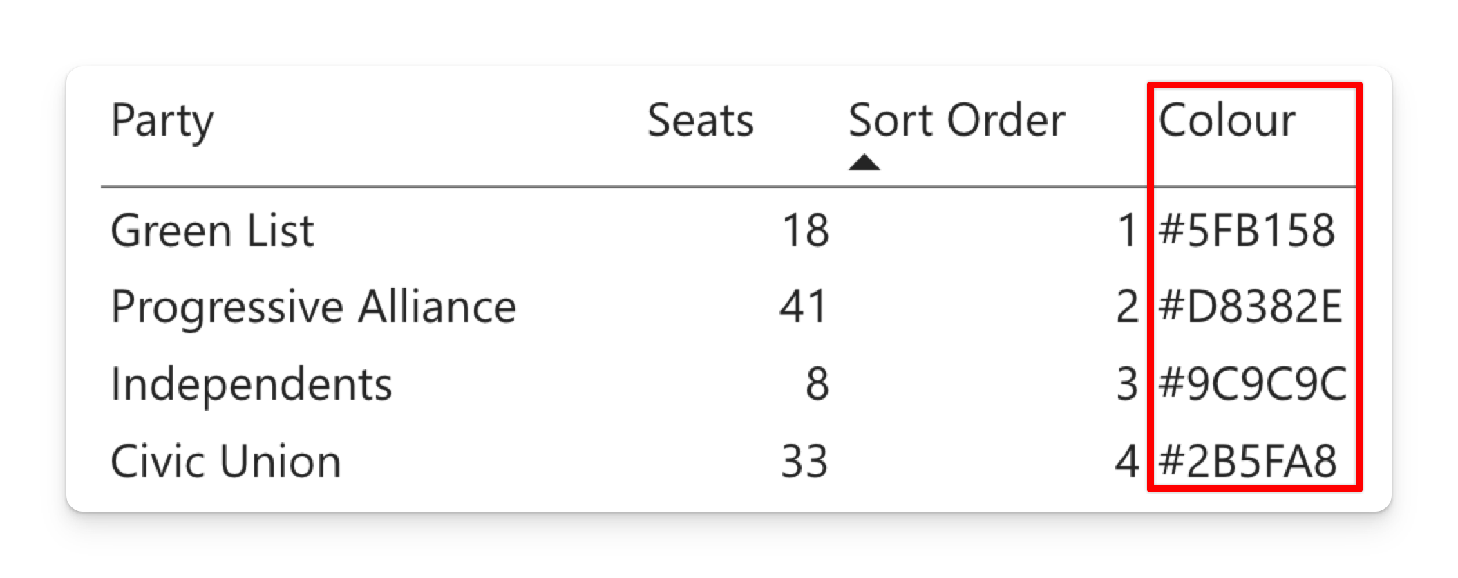
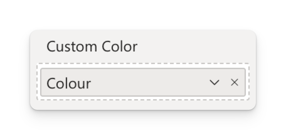
The Colour column supplies the highest-priority colour source through Custom Color. Those values override the Data Colors pickers and theme palette.
1. Custom Color — colours from your model
Bind a text column of hex codes to the Custom Color well and the party's colour comes straight from the data.
| Party | Seats | Colour |
|---|---|---|
| Green List | 18 | #5FB158 |
| Progressive Alliance | 41 | #D8382E |
| Civic Union | 33 | #2B5FA8 |
This is the right choice when:
- Party colours are official and shouldn't be re-picked per report.
- The same chart appears in several reports and must match across all of them.
- Parties come and go with the data — a new party arrives with its colour already attached, rather than landing on an arbitrary palette slot.
Notes:
#RRGGBBis the safe format. Three-digit hex (#F00) and CSS colour names (red) also work.- Put the same value on every row of a party; the visual reads it per party.
- It overrides the Format pane. While a party has a Custom Color value, its picker under Data Colors does nothing. That's the most common "why won't this colour change?" — see Troubleshooting.
- Leave the value blank for a party and it falls through to tier 2 or 3, so you can pin the two colours that matter and let the rest come from the theme.
2. Data Colors — colours per report
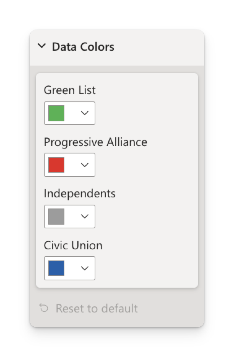
Format → Data Colors lists one colour picker per party currently in the chart.
- The list is rebuilt from the data, so it always reflects the parties on screen — filter to three parties and you get three pickers.
- A colour you pick is stored with the report, keyed to the party, and survives refreshes.
- Use this for one-off reports and for overriding a single party without touching the model.
3. The theme palette — the default
With neither of the above, each party takes the next colour from your report theme's data colour palette, assigned in the order parties first appear in the data.
Because the palette is handed out in order of appearance, removing a party changes the colours of the parties after it. A slicer that filters out one party will recolour the rest.
If colour consistency matters — and for parties it almost always does — pin them with the Custom Color field or the Data Colors pickers rather than relying on the palette.
The palette the visual draws from is your report theme's dataColors array. Putting your organisation's category colours there gives every visual in the report — Parliament Chart included — sensible defaults with nothing to configure per chart.
Choosing a colour scheme
- Political charts: use the parties' own colours. Readers recognise them faster than any legend.
- Non-political charts: a single hue in varying lightness reads as an ordered scale; distinct hues read as unordered categories. Pick to match your data.
- Check the contrast between neighbouring wedges — they touch, so two similar colours side by side merge into one block. Reordering with Sort Order, or turning on Seat outline, both help.
- Don't rely on colour alone. Keep the legend on, or seat counts on, so the chart is still readable in high contrast and to colour-blind readers.
Next steps
- Interactivity — clicking, hovering, cross-filtering and tooltips.
- Formatting reference — every setting, and the report-theme JSON.
- Troubleshooting — when a colour or a legend entry doesn't behave.