Layout & arc
Everything about the shape of the arch — how wide it is, how the parties are ordered around it, and what sits in the middle. All of it lives on the Layout card in the Format pane.
| Setting | Options | Default |
|---|---|---|
| Arc | 90 – 360 degrees | 180 |
| Seat outline | On · Off | Off |
| Show Total Seats | On · Off | On |
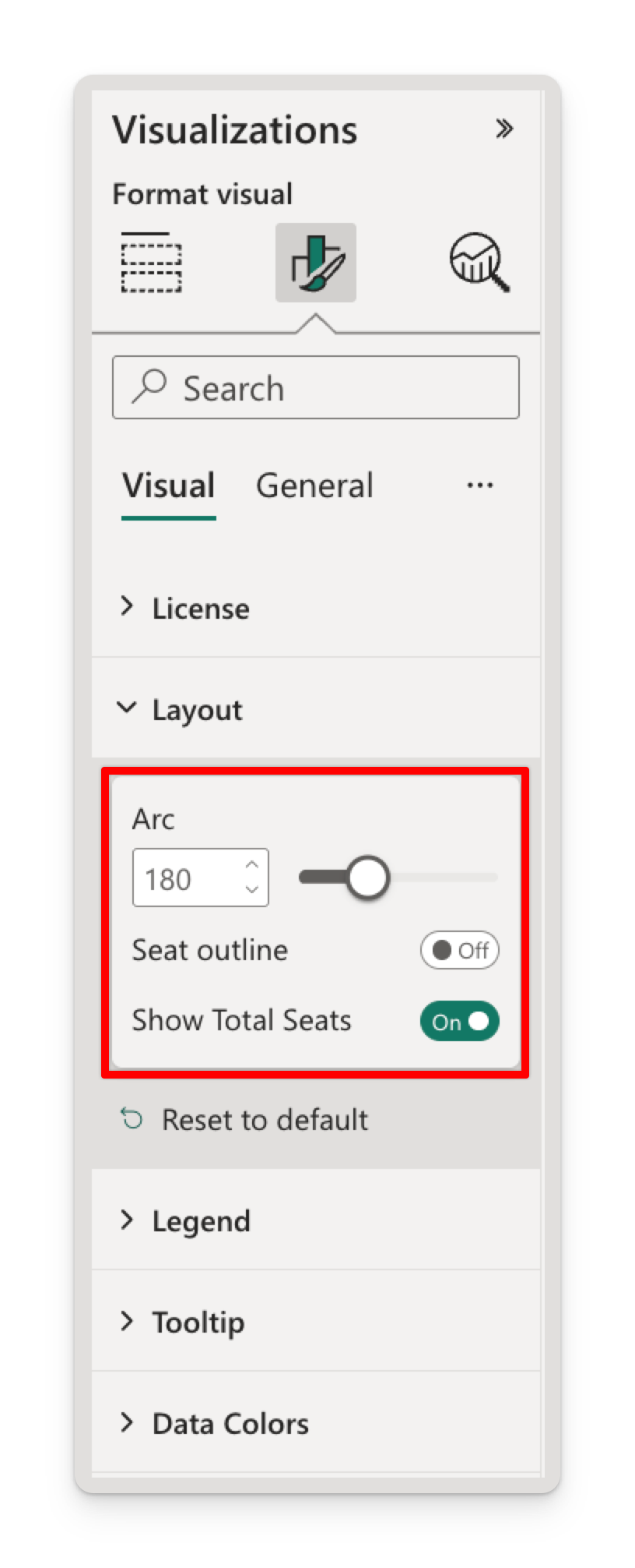
Arc
The Arc slider sets the angular width of the chart in degrees. The arch is always centred on the vertical axis, so widening or narrowing it opens and closes symmetrically.
| Arc | Shape | Use it for |
|---|---|---|
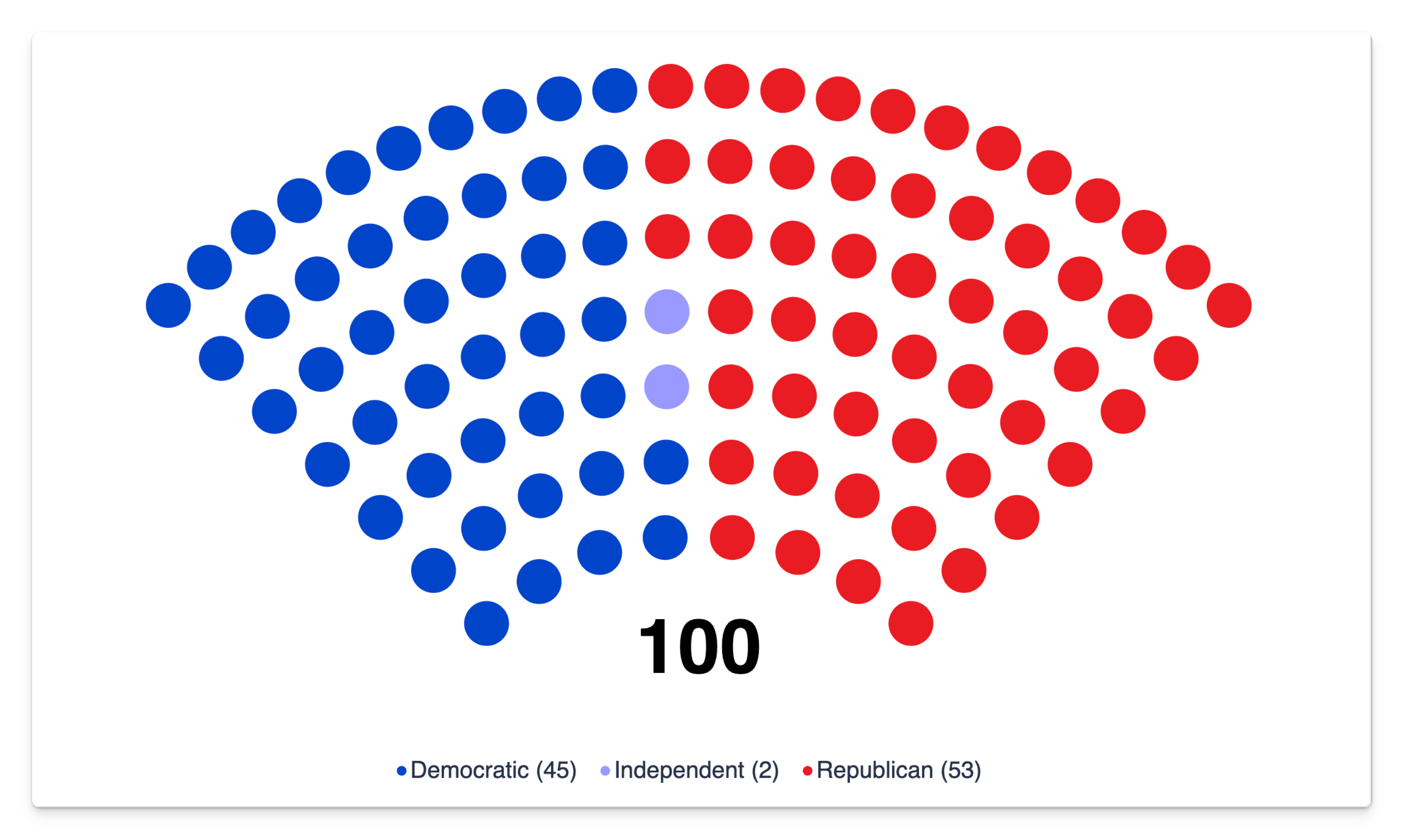
| 90° | A narrow wedge pointing up | Small groups where you want tall, chunky seats |
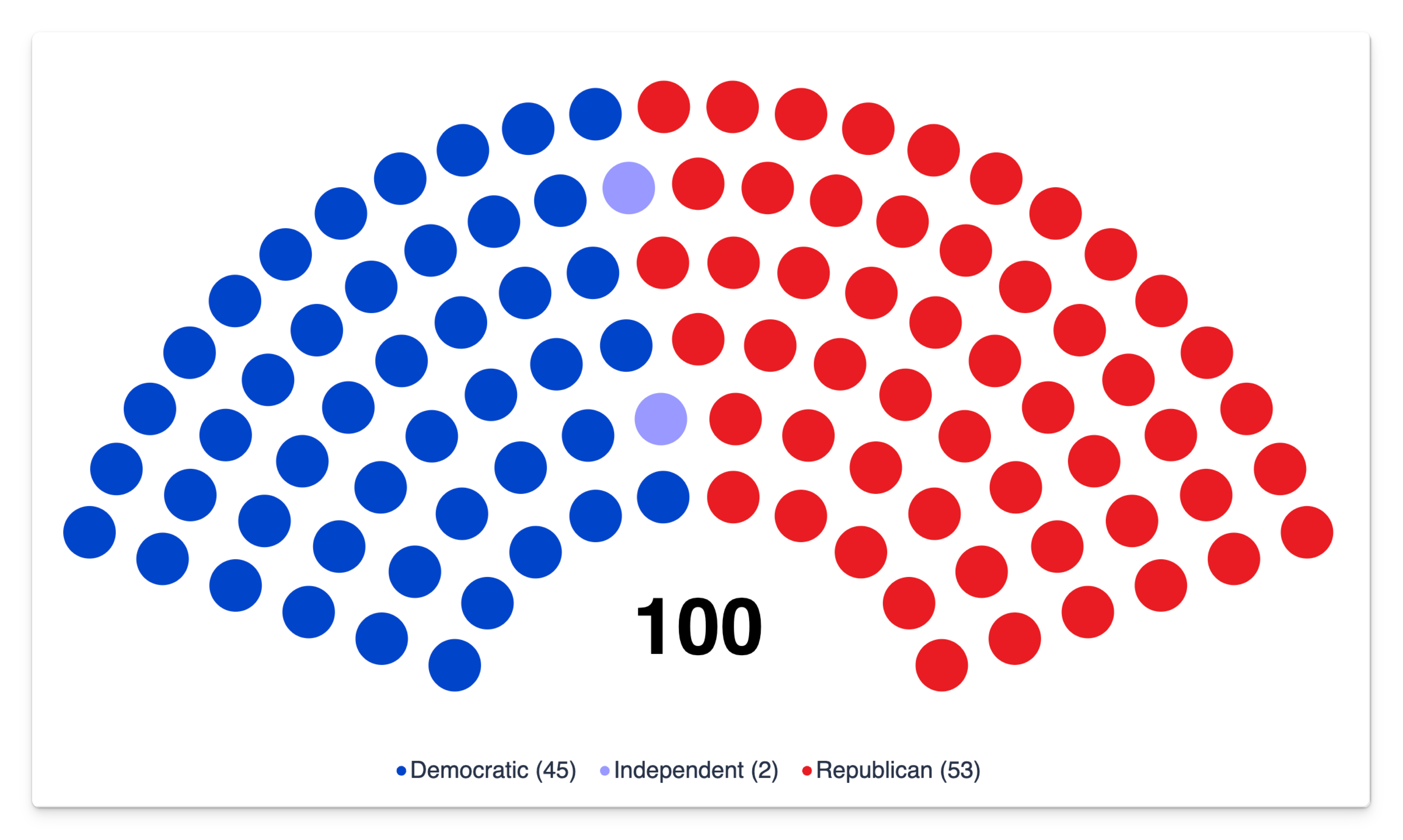
| 120° – 160° | A deep, compact arch | Tall, narrow visual containers |
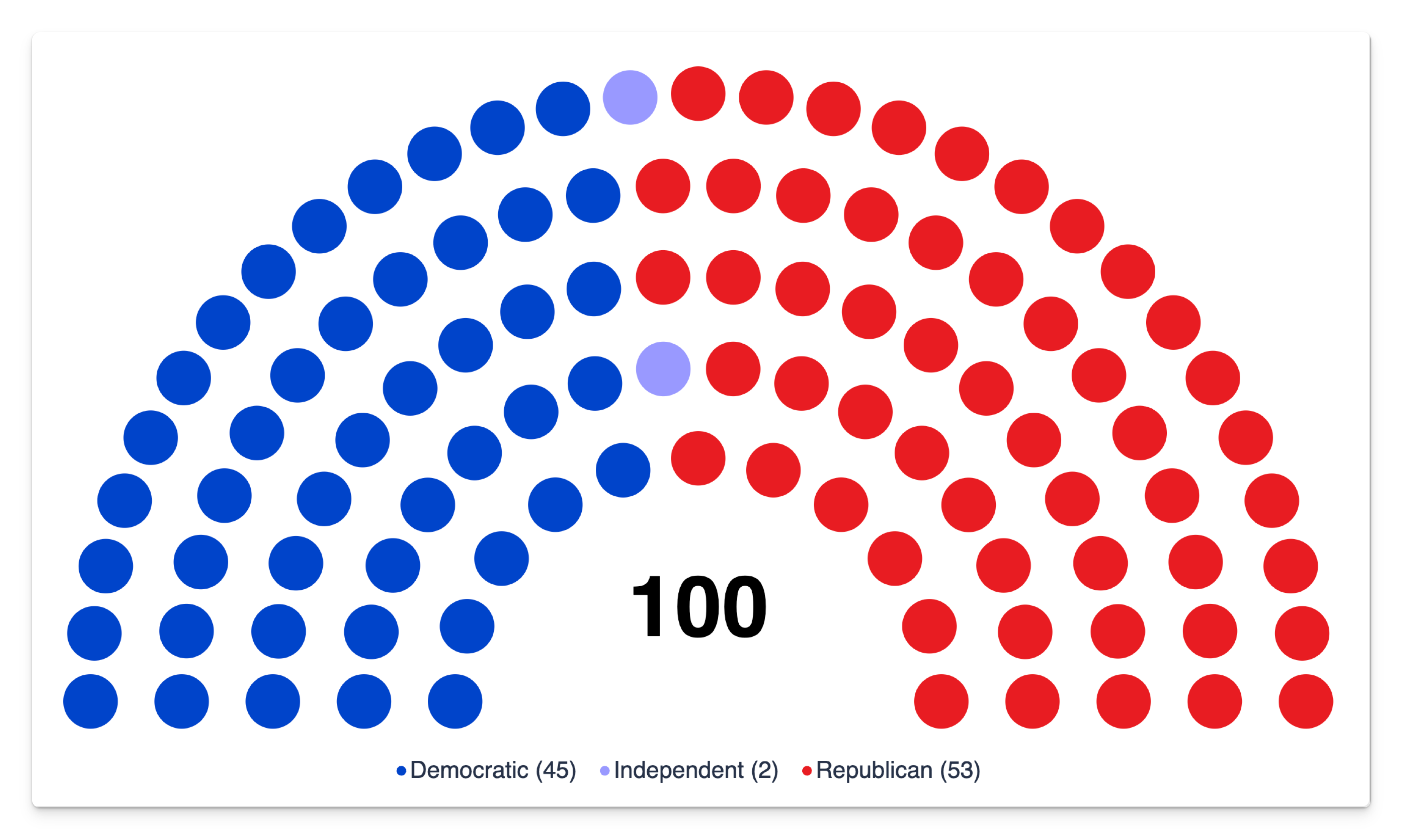
| 180° | The classic hemicycle | Parliaments, assemblies, senates — the default |
| 200° – 260° | A wide, embracing arch | Wide containers; a fuller, more modern look |
| 300° – 350° | A near-ring with a visible seam | Emphasising that the total is a closed set |
| 360° | A closed ring | Non-political categorical breakdowns — a countable donut |
| 90° | 140° | 180° |
|---|---|---|
 |  |  |
| 240° | 320° | 360° |
|---|---|---|
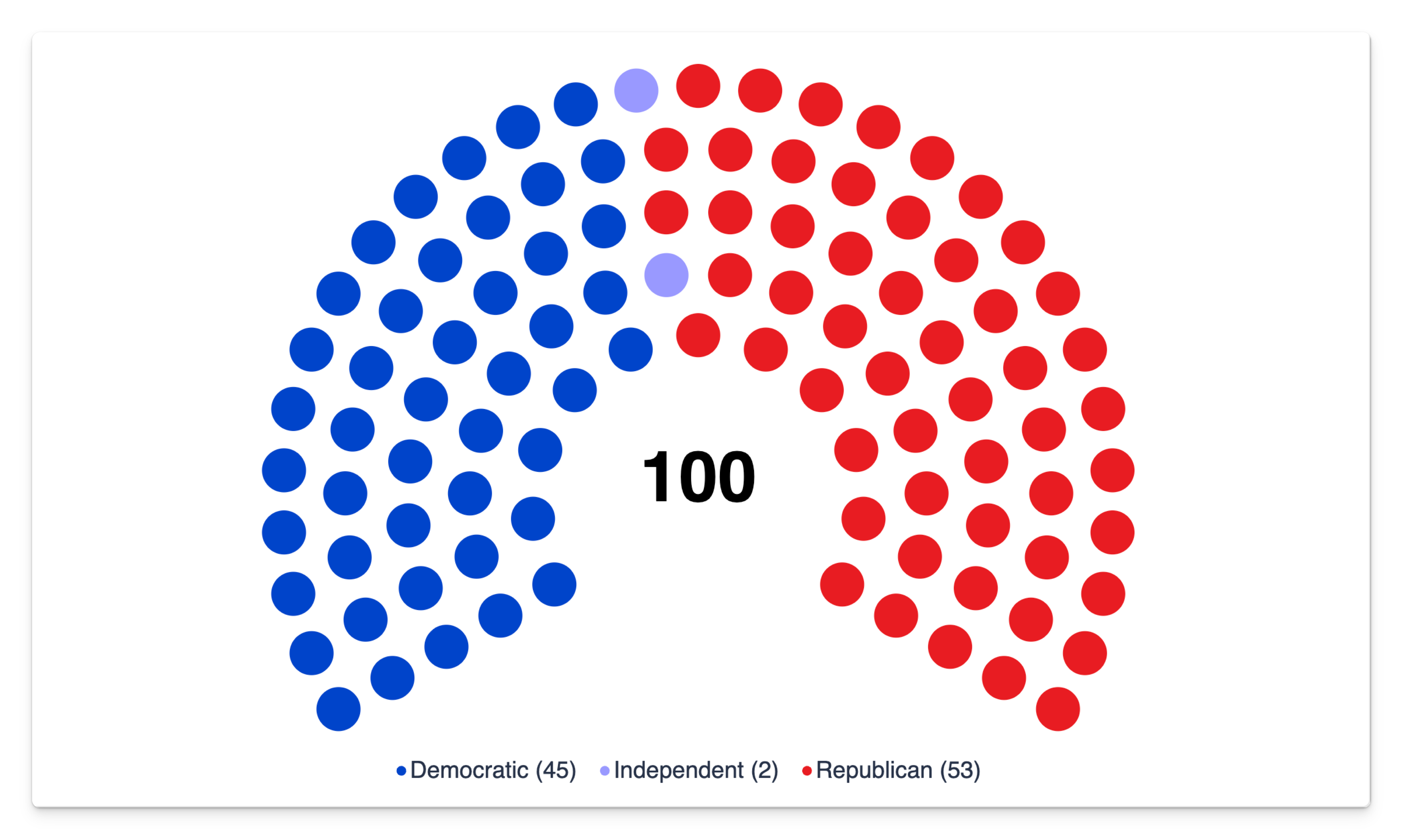 | 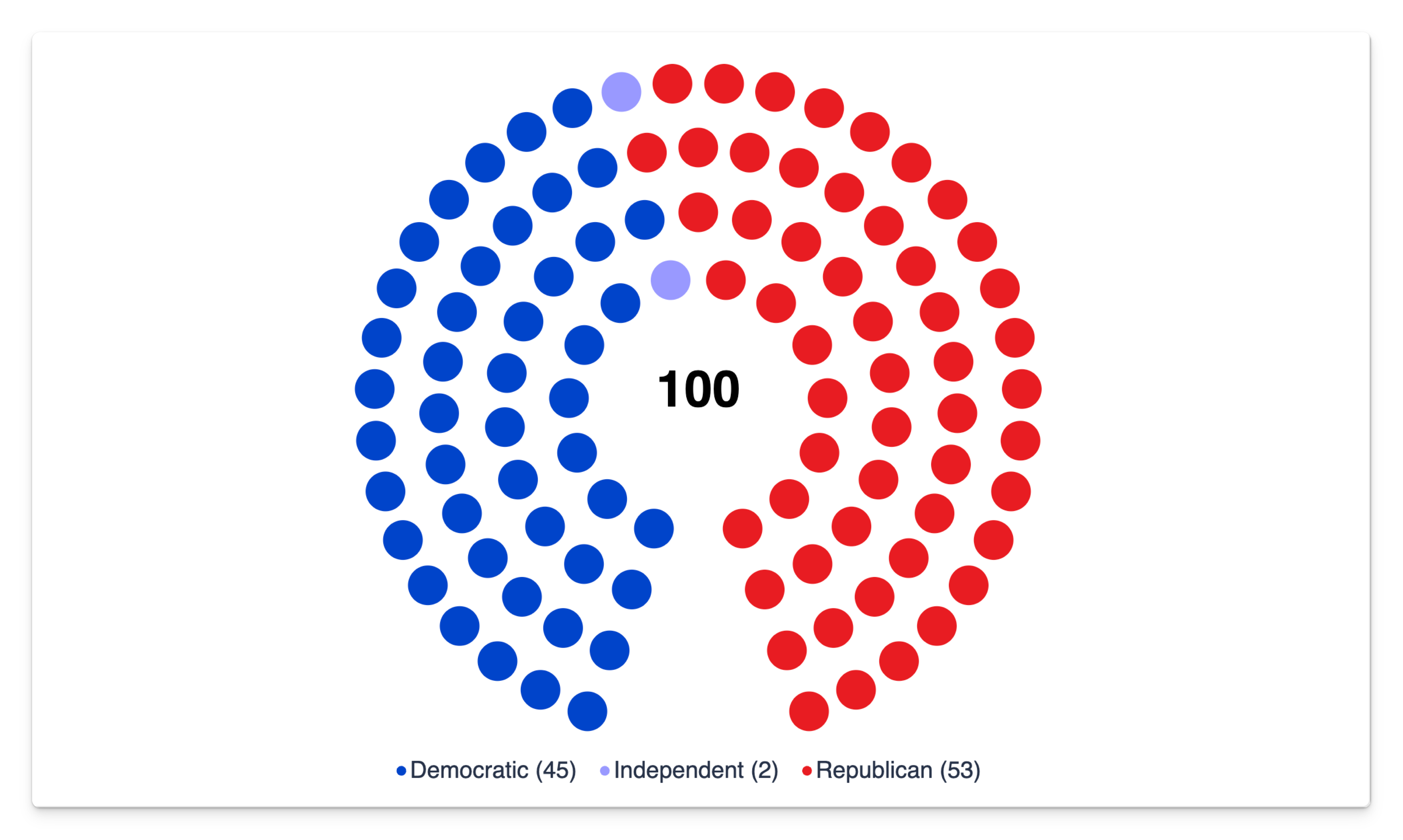 | 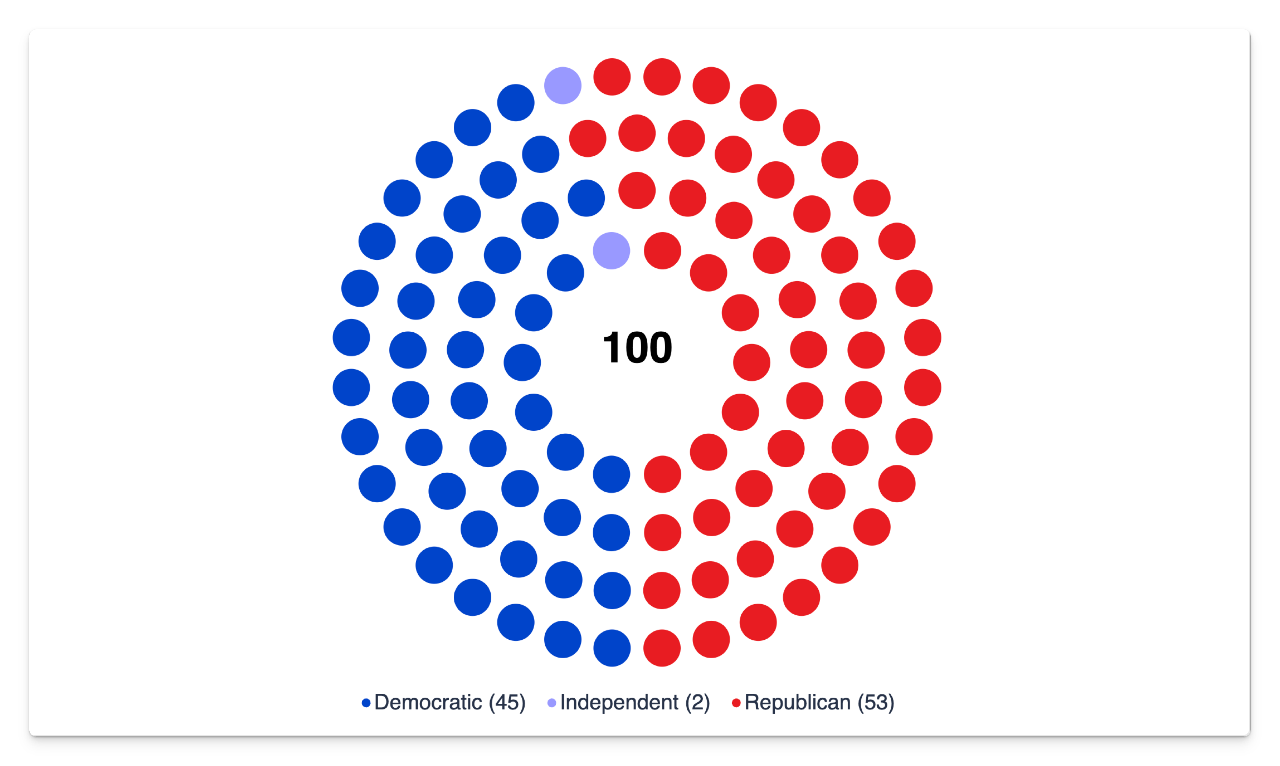 |
The same 100-seat US Senate dataset and visual size in every example.
The arch is scaled to fill whatever space is left after the legend, so the arc and the shape of your visual container interact. A wide, short container suits a wide arc (200–260°); a squarer container suits 180°; a tall, narrow one suits a narrow arc (120–150°). If the chart looks small and lost in its box, that's usually the fix.
What the arc changes underneath
Rows, seat size and spacing are all calculated for you from the seat count and the arc — there are no settings for them, and nothing to pre-compute.
- Rows come from the seat count: more seats means more concentric rows, not smaller dots forever.
- Seat size shrinks as seats get denser, and always leaves a visible gap between neighbours.
- The hole in the middle is a fixed proportion of the arch and is where the total seats label goes.
- On an open arc the two arms end flush with a seat at each tip; at a full 360° the ring closes evenly, with the seam at the bottom.
The practical consequence: a 12-seat chart draws big dots in one or two rows, and a 650-seat chart draws small dots in many rows, without you changing anything.
Seat and party ordering
Parties are drawn as contiguous wedges, in order, starting at the left end of the arch and sweeping round to the right. Getting that order right is the highest-value thing you can do to a parliament chart, because neighbouring wedges imply adjacency.
The default: alphabetical
With no Sort Order field bound, parties are ordered alphabetically by name — in the arch and in the legend. That's rarely the order you want.
This is the one place the Parliament Chart doesn't follow your model. Setting Sort by column on your Party column changes the order Power BI hands over, but the visual re-sorts parties itself: by Sort Order if you bind one, otherwise alphabetically. To control the arch, use the Sort Order well.
Setting an explicit order
Add a numeric column to your model and bind it to the Sort Order well. The lowest value sits at the left end.
| Party | Seats | Sort Order |
|---|---|---|
| Green List | 18 | 1 |
| Progressive Alliance | 41 | 2 |
| Independents | 8 | 3 |
| Civic Union | 33 | 4 |
- Values needn't be consecutive —
10, 20, 30leaves room to insert a party later without renumbering. - Only the lowest value found for a party is used, so the column can live on a per-seat table where it repeats on every row.
- The legend follows the same order, so the two never disagree.
| Alphabetical | Custom Sort Order |
|---|---|
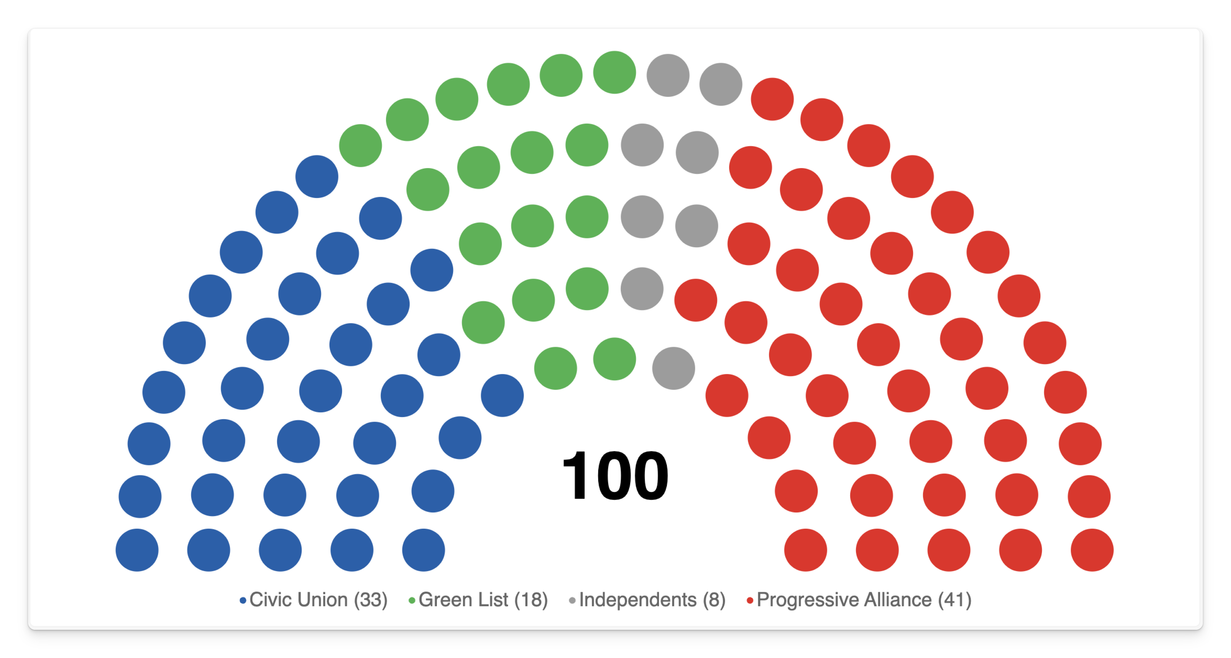 | 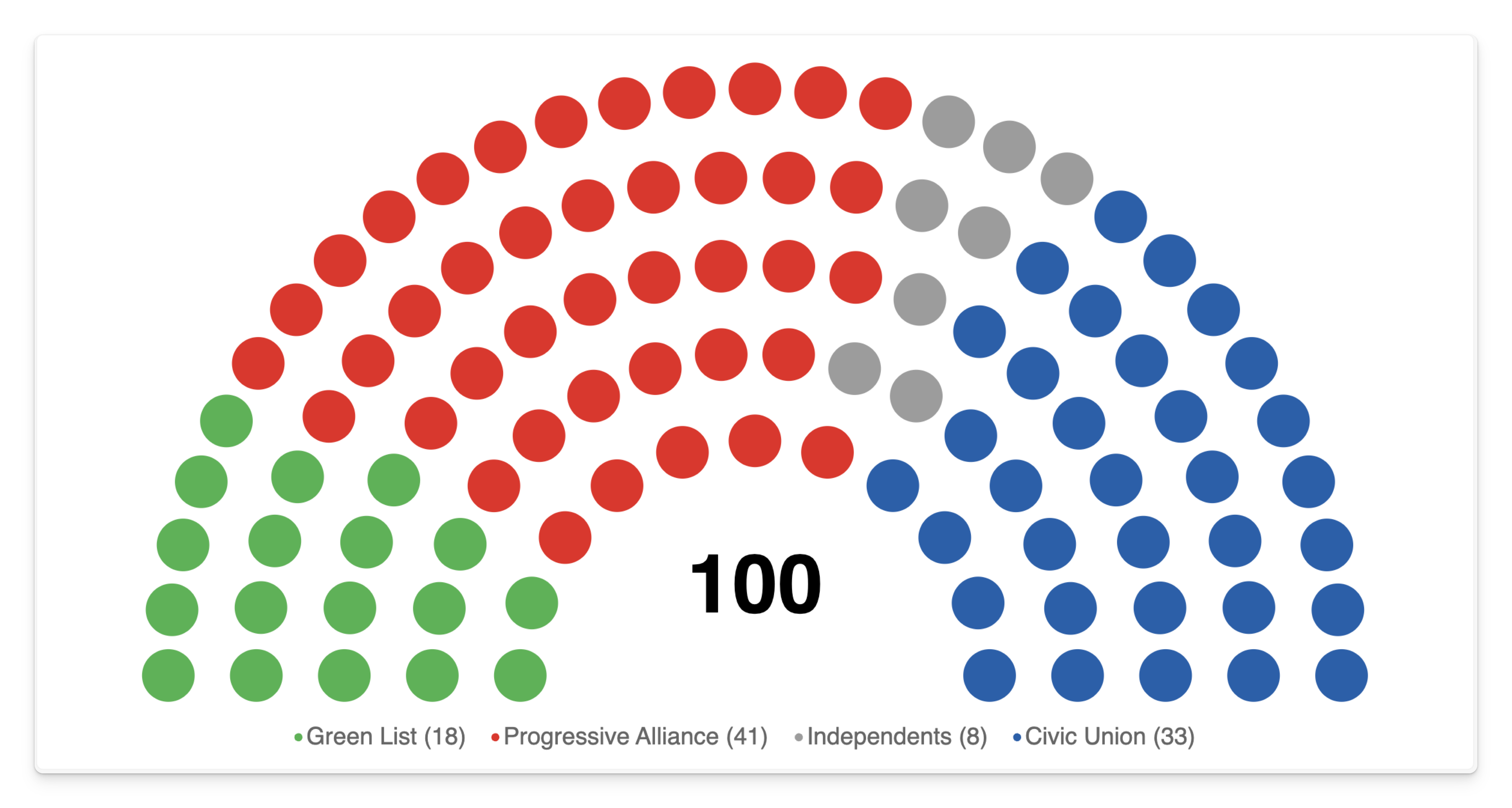 |
Both charts use the same 100 seats and four parties. The Sort Order values from the table are applied on the right.
A party with no Sort Order value falls back to alphabetical placement relative to the others, which puts it somewhere unpredictable. If you bind the field, fill it in for every party — including "Other", "Independent" and "Vacant".
Which order to choose
| Chart | A sensible order |
|---|---|
| National parliament | The political left-to-right axis your audience already reads. |
| Coalition analysis | Government parties first, then the crossbench, then opposition — so the governing block reads as one arc. |
| Poll or vote result | Largest to smallest, so the winning block anchors one end. |
| Non-political breakdown | Largest to smallest, or a natural sequence (severity, seniority, stage). |
Ordering within a party
Seats inside a wedge follow the order your data arrives in, and they always stay contiguous and lateral — a party occupies a wedge spanning every row, rather than filling a ring at a time. There is no setting for the order of individual seats within a party, and in practice it isn't visible: every seat in a wedge is the same colour.
Seat outline
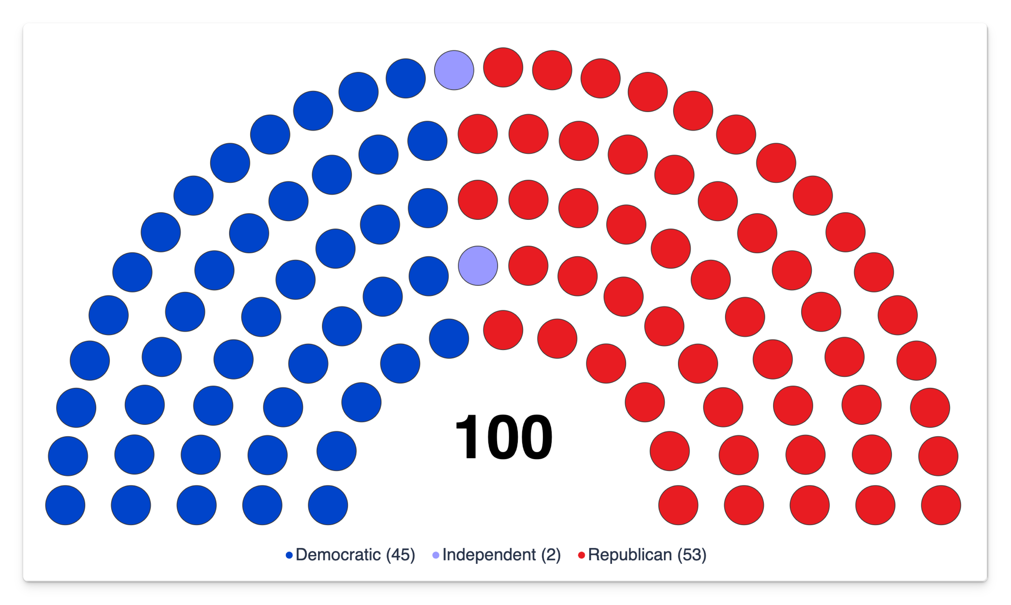
Off by default. Turning it on draws a thin dark border around every seat.
| Turn it on when… | Leave it off when… |
|---|---|
| Party colours are pale or similar and the dots blur together | Colours are strong and distinct |
| Seats are large — a small chamber, or a wide container | Seats are small — a 650-seat chart, where outlines add visual noise |
| You're printing or exporting to PDF | The chart is displayed on screen at a comfortable size |
| Seat outline off | Seat outline on |
|---|---|
|  |
The outline colour is fixed and isn't configurable.
The centre label
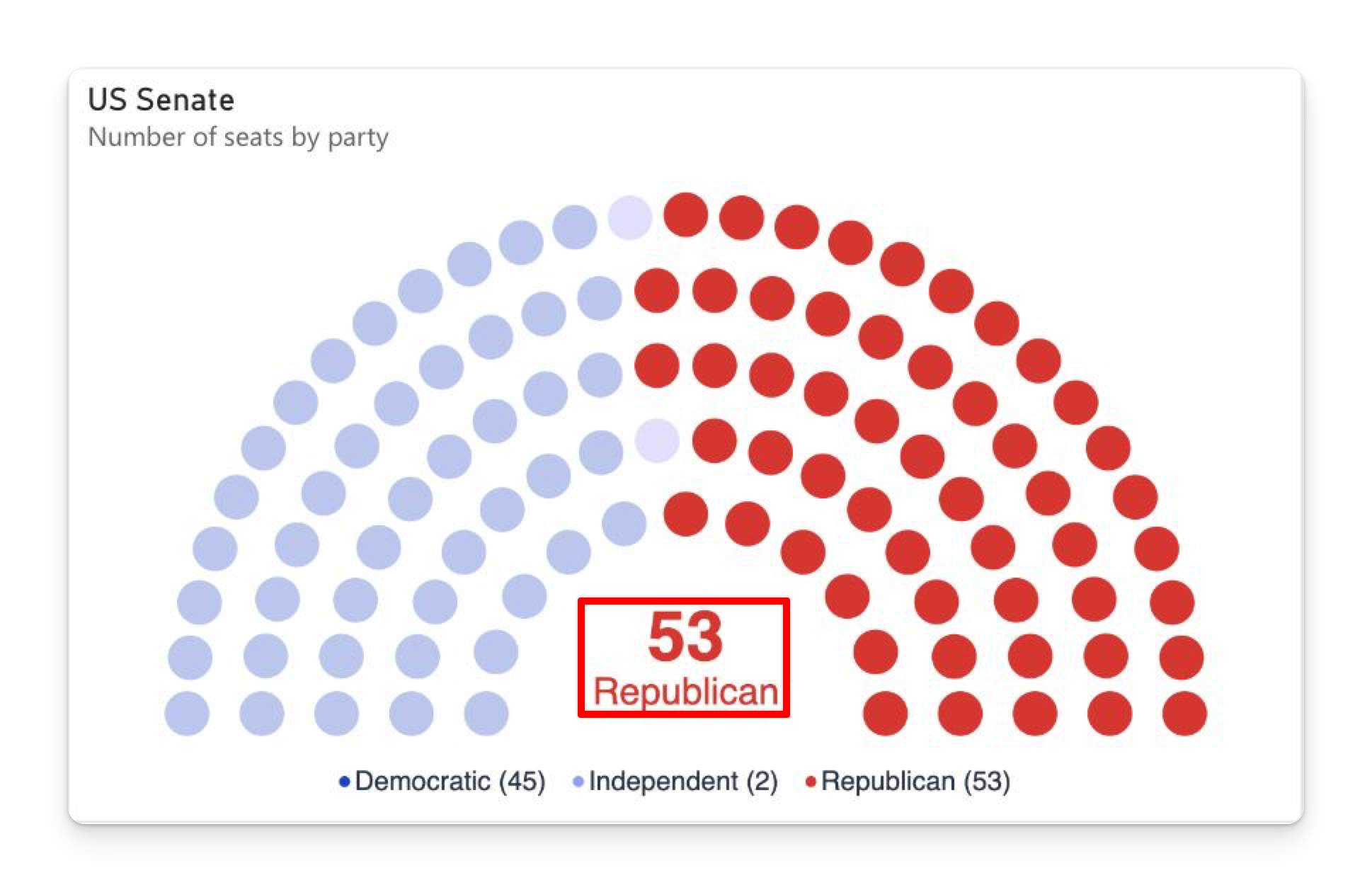
Show Total Seats — on by default — puts the total number of seats in the middle of the arch, in bold. It's more than a static number: it responds to what the reader is doing.
| State | What the centre shows |
|---|---|
| At rest | The total seat count, in black. |
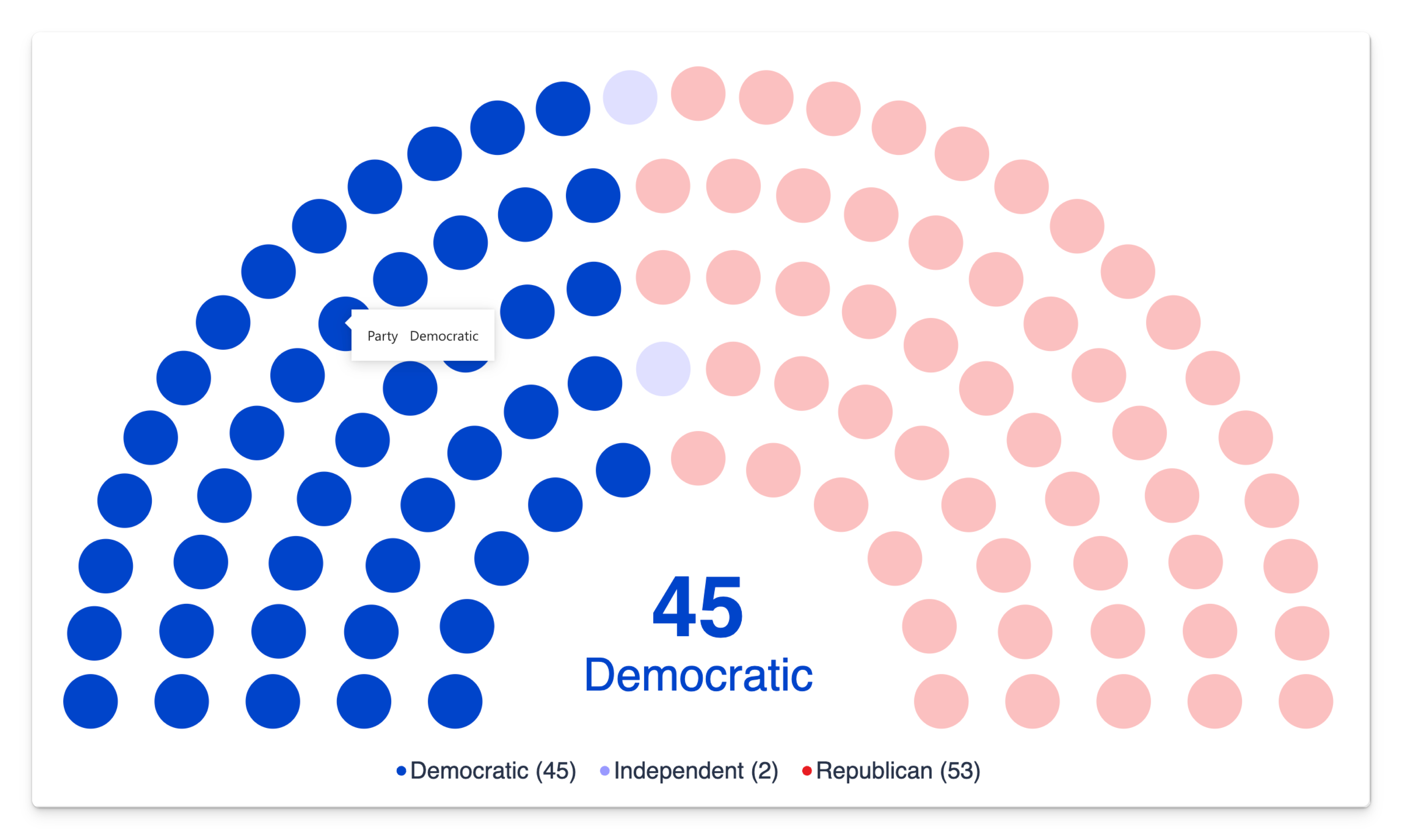
| Hovering a party | That party's seat count, in the party's colour, with the party name underneath. |
| A party selected | The same — count in the party's colour, name underneath. |
| Several parties selected | The combined count of the selection. No name, and the default colour. |
| Cross-highlighted by another visual | The highlighted seat count, in the party's colour if the highlight covers a single party. |
| At rest | Hovering Republican | Selecting Democratic |
|---|---|---|
|  |  |
- The label is sized to the empty space inside the arch, so it grows and shrinks with the chart rather than with a font-size setting. There's no size or colour control for it.
- A long party name shrinks to fit the space below the number, and is shortened with an ellipsis only when it would otherwise become unreadable.
- Turning it off gives the arch more room: the layout reserves space for the label, so switching it off makes the seats larger. It also turns off the party-name band, since the two share the same space.
Clicking the total clears the selection rather than selecting the nearest party. It's the quickest way to reset the chart after clicking around.
Sizing and responsiveness
The arch is scaled to fit whatever space remains once the legend has taken its margin, and it re-scales on every resize.
- Moving the legend from Bottom to Right trades vertical space for horizontal. With a wide arc, the bottom position usually wins; with a narrow arc, the side positions do.
- Turning the legend off entirely gives the whole container to the arch. Combined with a wide arc and Show Total Seats on, that makes a strong headline visual.
- On very small tiles the arch keeps drawing and everything shrinks proportionally, including the centre label.
High contrast
When Windows high-contrast mode is on, Power BI hands the visual the system palette and it takes over completely: every seat is drawn in the system foreground colour, on the system background, with the legend text to match.
That means parties are no longer distinguishable by colour in high-contrast mode. The chart still communicates the total, the relative sizes of the wedges and their order; hover and selection still name the party in the centre. Your colour settings are kept and come straight back when high contrast is switched off.
Next steps
- Legend & colours — the three sources a party colour can come from.
- Interactivity — hover, selection and cross-filtering.
- Formatting reference — every setting with its default.