Interactivity
The Parliament Chart is a first-class Power BI citizen: clicking a party filters the rest of the page, the legend filters too, right-click opens Power BI's own menu, and the chart responds when other visuals filter it.
Hovering a party
Move the pointer anywhere over a party's wedge — over a seat, or in the gaps between seats — and the whole party lights up:
- Every other party dims to 30%, so the wedge you're on stands out.
- The centre label switches to that party's seat count, in the party's colour, with the party name underneath.
- Nothing is filtered. Hover is a purely visual read-out; the rest of the report doesn't move.
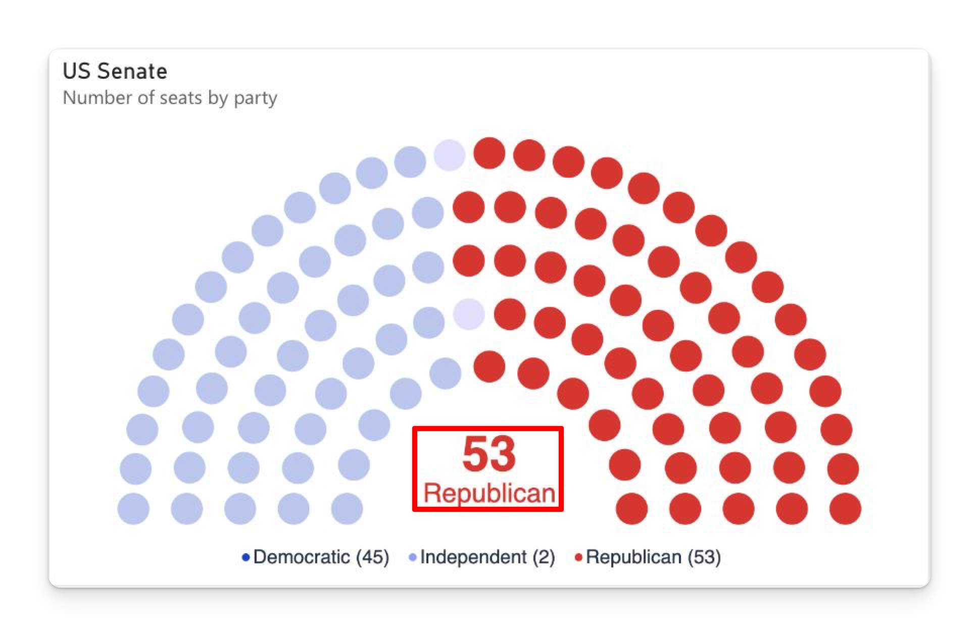
Hovering works across a party's whole wedge rather than seat by seat, which makes small seats on a large chart much easier to interrogate. Moving off the arch entirely clears it.
Hovering a legend entry does exactly the same thing.
Hover emphasis is suppressed while something is selected — a selection is a deliberate state and shouldn't flicker as the pointer moves. Clear the selection and hover resumes immediately.
Selecting and cross-filtering
| Action | Result |
|---|---|
| Click a party (a seat, or the gap between its seats) | Selects that party and cross-filters the rest of the report. |
| Click a legend entry | The same — selects the party. |
| Ctrl+click (⌘+click on Mac) | Adds the party to, or removes it from, the selection. |
| Click empty canvas, or the centre total | Clears the selection. |
What you see when a party is selected:
- Its seats stay at full strength; everything else dims to 30%.
- The centre label shows the selected party's seat count, in its colour, with its name below.
- Select several parties and the centre shows the combined count, with no name.
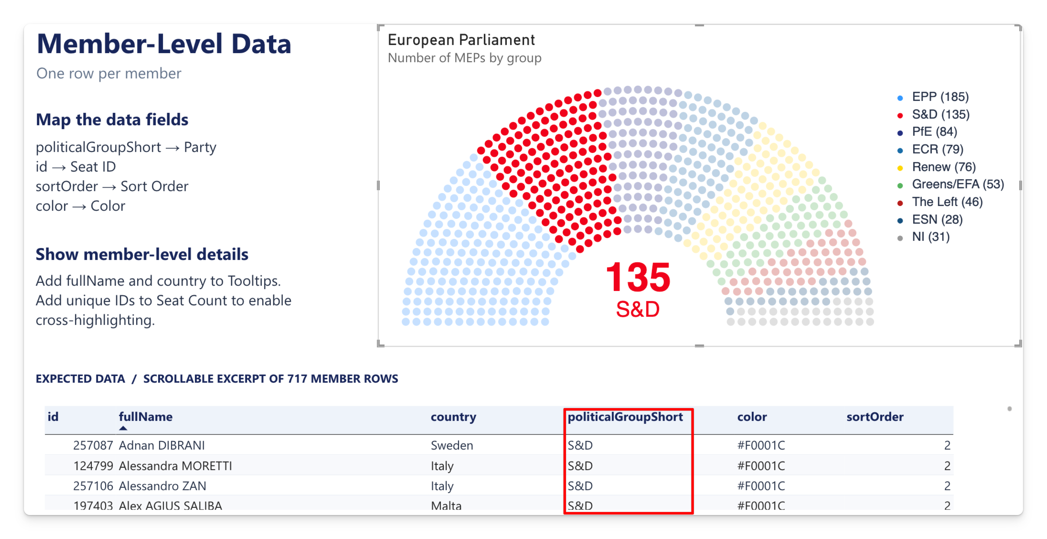
Selecting the S&D wedge filters the report’s member table to that group.
You don't have to hit a dot. Clicks are matched to the nearest seat, so the gaps inside a wedge select the party too — which matters on a 650-seat chart where each dot is a few pixels across.
Selections combine across visuals: ctrl+click a party here and a bar in another visual, and the report is filtered by both.
Right-click menu
Right-clicking a seat opens Power BI's own context menu for that data point — Include, Exclude, Drill through, Show as a table, Copy, and any drill-through pages you've defined.
Right-clicking empty space opens the visual-level menu instead.
Being filtered by other visuals
When another visual on the page is selected, Power BI's default interaction is highlight — and the Parliament Chart shows highlights at seat resolution, not just by dimming whole parties.
| Your data shape | What a highlight does |
|---|---|
| Party totals | The seats each party keeps under the other visual's selection stay bright; the rest of that party's seats dim. A party with 41 seats of which 20 survive the filter shows 20 bright dots and 21 faded ones. |
| One row per seat, with a Seat Count measure | The individual seats kept by the selection stay bright; the rest dim. |
| One row per seat, no Seat Count measure | Nothing dims. See the warning below. |
The centre label follows: it shows the highlighted seat count, in the party's colour when the highlight covers a single party.
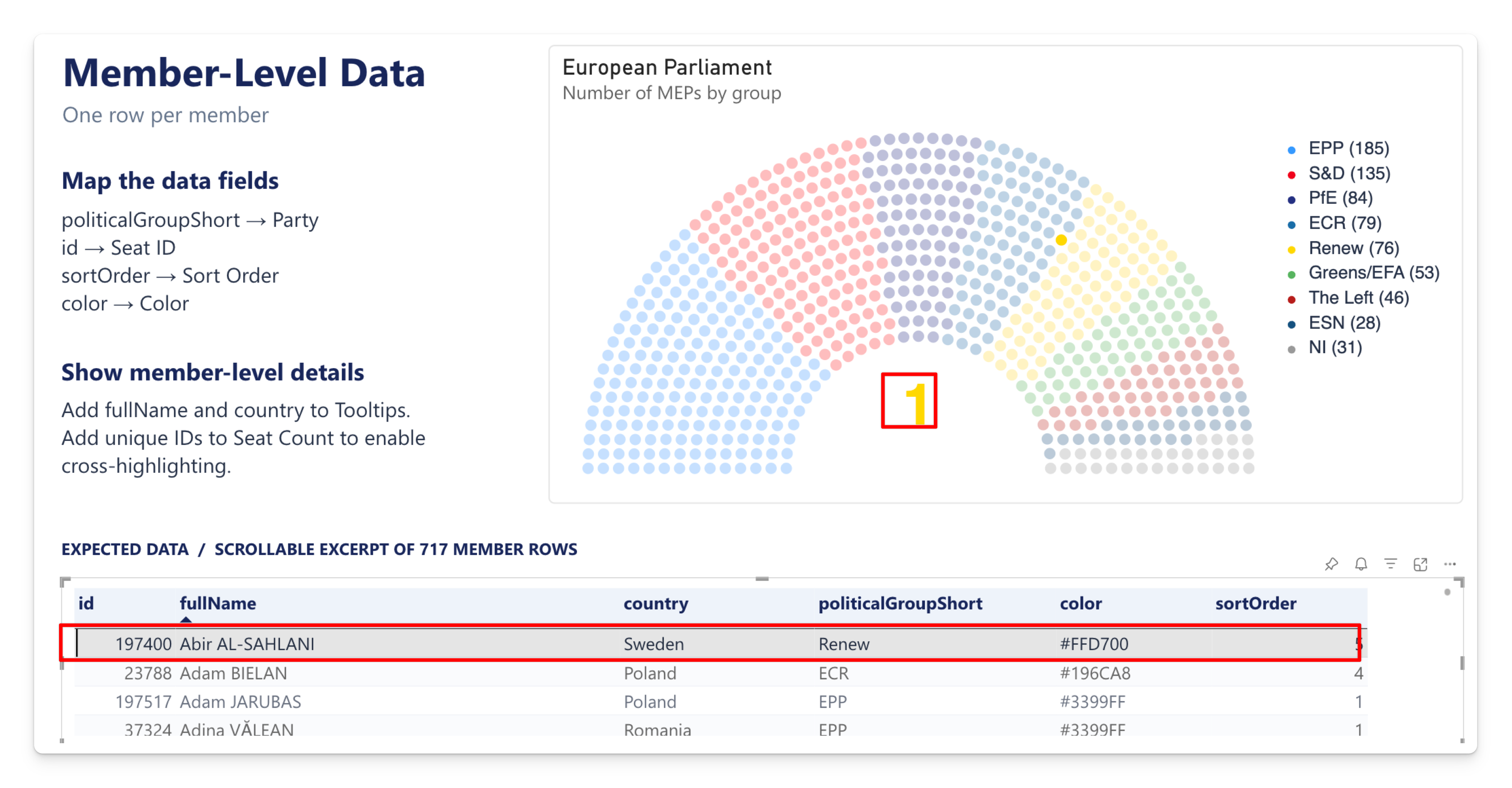
Selecting one member in the table highlights that member’s seat while the full 717-seat chamber remains visible.
In per-seat mode the visual only knows which seats survived another visual's selection if a numeric measure sits in the Seat Count well. Without one, cross-highlighting leaves the arch untouched. Add something like Seats = COUNTROWS ( 'Members' ) — it doesn't change the chart's size, it just carries the highlight. See Shaping your data.
Highlight vs filter
Highlight keeps every party on screen and dims what's excluded, so the reader sees the part-of-whole. Filter removes the excluded seats entirely, so the arch shrinks and the total drops.
To switch: Format ribbon → Edit interactions, then pick the filter icon over the Parliament Chart.
Highlight is usually the better default for a seat chart — the whole point is a fixed, known total, and watching parts of it light up says more than watching the chamber shrink.
What wins when several things are active
The chart applies emphasis in a strict order, so states never fight:
- Selection — if anything is selected, that's what's shown.
- Hover — otherwise, the hovered party.
- Cross-highlight — otherwise, another visual's highlight.
- Nothing — every seat at full strength.
Tooltips
Format → Tooltip — on by default, with a single Show toggle.
Hovering a seat shows:
- Party — the party the seat belongs to.
- Your Tooltips fields, in the order you dropped them, each labelled with its column name and formatted with its model format string.
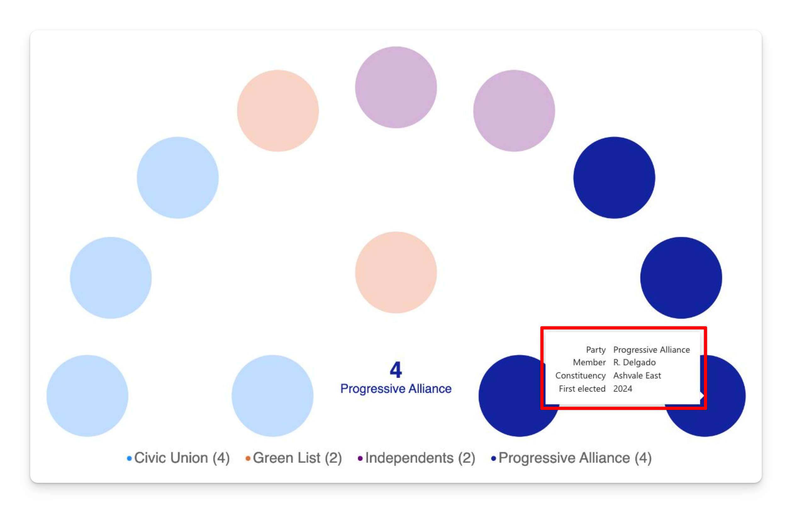
The first row is always labelled Party, whatever your column is called. The rows below it use your own field names.
What appears depends on your data shape: with one row per seat, each dot shows its own values — the member's name, their constituency. With party totals, every seat in a party shows the same thing, unless you've split the party into sub-groups by binding a column to Tooltips.
Turning Show off removes tooltips entirely; hover emphasis and the centre label still work.
Report-page tooltips
The Parliament Chart supports report-page tooltips, which is the way to put measures, mini-charts or a member photo behind a seat:
- Create a page, and in Page information turn on Allow use as tooltip.
- Size it under Canvas settings → Tooltip.
- Add whatever visuals you want, filtered by the same party field.
- Select the Parliament Chart, and under Format → General → Tooltips, set Type to Report page and pick your page.
This is also the answer to "I want a measure in the tooltip" — the Tooltips field well takes columns only, but a tooltip page takes anything.
Accessibility
- High contrast is fully supported. The chart, the legend and the landing page all switch to the Windows system palette. Note that every seat is drawn in the system foreground colour, so parties are told apart by position and by the legend rather than by colour — see High contrast.
- The landing page is keyboard accessible — its Required/Optional tabs are reachable by Tab and navigable with the arrow keys, with visible focus indicators.
- Individual seats are not keyboard-focusable. Keyboard and screen-reader users can reach the visual and read its title, but not tab through the seats. If your report has an accessibility requirement, pair the chart with a table or matrix visual carrying the same party and seat-count data — a good practice for any dot-based chart, since the numbers are what a screen reader needs anyway.
- Don't rely on colour alone to convey party identity. Turning on Legend → Seat counts puts the numbers in text, where everyone can get at them.
Next steps
- Use cases — worked examples with recommended settings.
- Formatting reference — every setting, with its default.
- Troubleshooting — when clicking or highlighting doesn't do what you expect.