Formatting reference
Every setting in the Parliament Chart's Format pane (the paint-roller icon), card by card, in pane order, with its range and default. For task-based walkthroughs, follow the links at the end of each section.
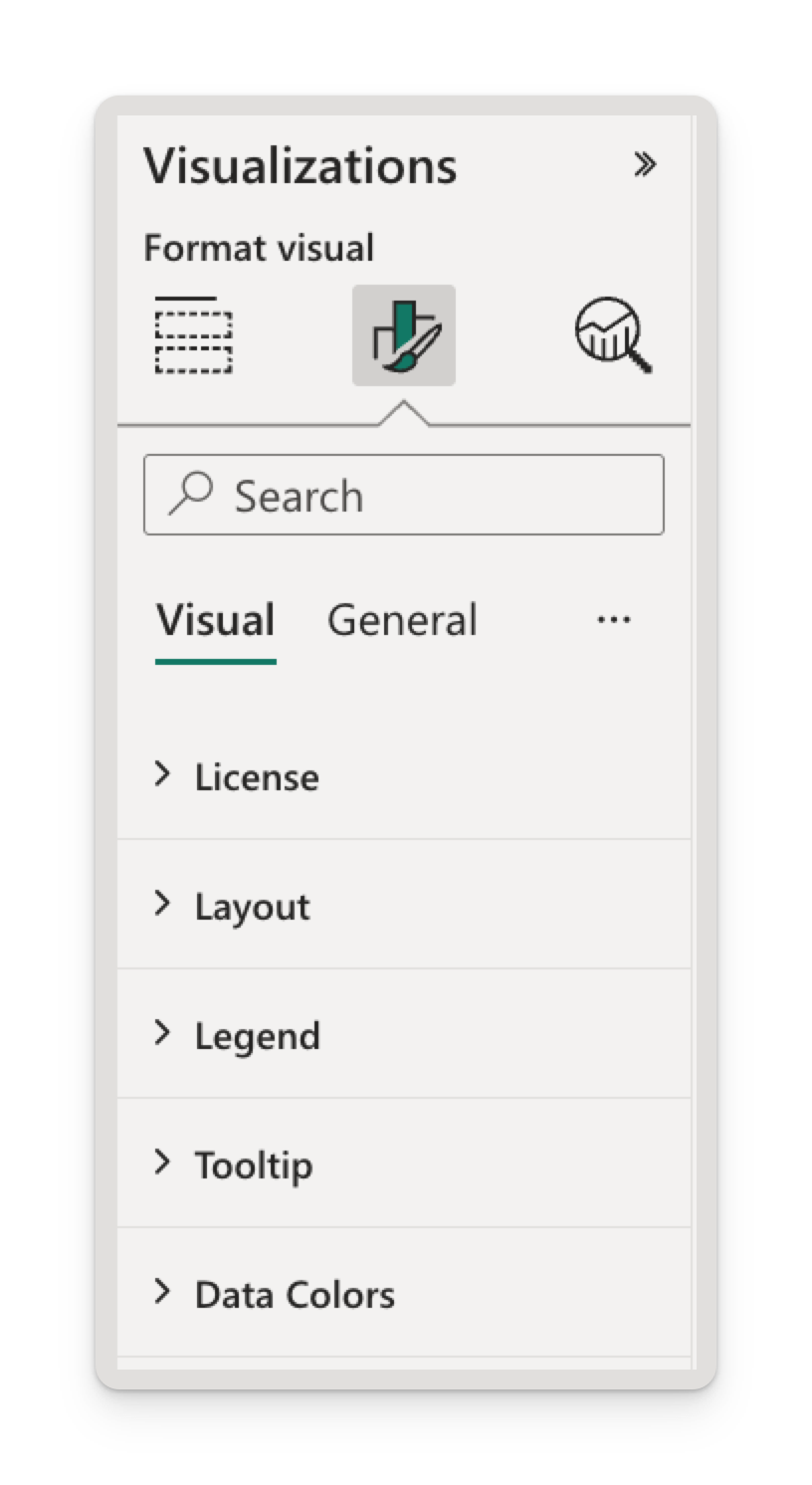
License
| Setting | Type | Default |
|---|---|---|
| License key | Text | (empty) |
| Status | Read-only text | (hidden until a key is entered) |
Only needed for environments AppSource licensing doesn't cover. See Direct license keys.
Layout
| Setting | Options | Default |
|---|---|---|
| Arc | 90 – 360 degrees | 180 |
| Seat outline | On · Off | Off |
| Show Total Seats | On · Off | On |
- Arc is the angular width of the chart. 180 is the classic hemicycle; 360 closes it into a ring. The arch stays centred on the vertical axis at every value.
- Seat outline draws a thin dark border around each seat. The colour isn't configurable.
- Show Total Seats puts the total in the middle of the arch, and switches to the hovered or selected party's count in that party's colour. Turning it off gives the arch more room, and also removes the party-name band.
- Rows, seat size and seat spacing are calculated from the seat count and the arc. There are no settings for them.
Legend
| Setting | Options | Default |
|---|---|---|
| Show | On · Off | On |
| Seat counts | On · Off | Off |
| Position | Top · Top center · Bottom · Bottom center · Left · Left center · Right · Right center | Bottom center |
| Show Title | On · Off | Off |
| Title Text | Free text | Party |
| Color | Any colour | #666666 |
| Text Size | 6 – 60 | 10 |
- Seat counts appends each party's total to its entry —
Labour (411)— formatted for the viewer's locale. - No title is drawn until Show Title is on.
- Legend order matches the arch: Sort Order if bound, otherwise alphabetical.
- Legend entries are clickable filters and hoverable highlights.
→ Legend
Tooltip
| Setting | Options | Default |
|---|---|---|
| Show | On · Off | On |
Turning it off removes hover tooltips entirely. Hover emphasis and the centre label are unaffected. Report-page tooltips are configured under General → Tooltips, not here.
→ Tooltips
Data Colors
| Setting | Options | Default |
|---|---|---|
| One row per party, named after the party | Any colour | The next colour from the report theme palette |
- One colour picker per party currently in the chart; the list rebuilds as the data changes.
- A colour bound to the Custom Color field overrides the picker for that party.
- Defaults are handed out in the order parties first appear in the data, so removing a party can shift the colours of the ones after it.
Settings the host overrides
| Mode | What changes |
|---|---|
| High contrast | Every colour comes from the Windows system palette: all seats take the foreground colour, the legend text too, on the system background. Parties are told apart by position and by the legend rather than by colour. Your settings are kept and return when high contrast is switched off. |
| Dashboard tiles / read-only hosts | Selection and cross-filtering are disabled by Power BI. Tooltips, hover emphasis and rendering are unaffected. |
| Cross-highlighting | Seats excluded by another visual's selection dim to 30%, at seat resolution. See Being filtered by other visuals. |
| Export to PDF / PowerPoint, email subscriptions | The visual reports its render status to Power BI, so exports wait for the arch to finish drawing. The license notification is never included in an export. |
Setting the Parliament Chart from a report theme
All of these settings can be set in a report theme JSON file, which is the practical way to standardize many reports — or to deploy a direct license key across a tenant. Use the visual's GUID as the key:
{
  "name": "Parliament Chart defaults",
  "visualStyles": {
    "parliament544886D08EFF4EE48B352842F1B02926": {
      "*": {
        "seats": [
          { "arcSpan": 180, "showOutline": false, "showTotalSeats": true }
        ],
        "legend": [
          {
            "show": true,
            "showSeatCounts": true,
            "position": "BottomCenter",
            "showTitle": false,
            "titleText": "Party",
            "labelColor": { "solid": { "color": "#666666" } },
            "fontSize": 10
          }
        ],
        "tooltip": [{ "show": true }]
      }
    }
  }
}
Values match the pane options exactly. position is one of "Top", "TopCenter", "Bottom", "BottomCenter", "Left", "LeftCenter", "Right", "RightCenter"; arcSpan is degrees.
Data Colors pickers are bound to individual parties, so they have no place in a "*" block. Set your organisation's category colours in the theme's top-level dataColors palette instead — the visual draws its defaults from it — or bind a Custom Color column.
Report themes set defaults. Anything an editor changes in the Format pane wins over the theme for that visual.
Arc is re-checked when the report loads. A value outside 90–360 — from a hand-edited theme file, or a report saved by an older build — is clamped back into range rather than breaking the visual, and a value that isn't a number at all falls back to 180.
Reports built with a version before v1.2.0.0, when the legend positions had different names, keep the position they were set to.
Deploying a license key through a theme
{
  "name": "ChartPad licensing",
  "visualStyles": {
    "parliament544886D08EFF4EE48B352842F1B02926": {
      "*": {
        "license": [{ "key": "PBI-your-key-here" }]
      }
    }
  }
}
Only set key. The status property is a read-only display line the visual fills in itself. See Direct license keys.
See also
- Data fields — what to put in each field well.
- Use cases — recommended settings per scenario.
- Troubleshooting — when a setting doesn't do what you expect.